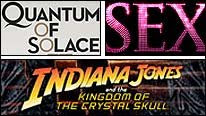
Fun little item on the BBC website today about how typefaces are chosen for movie posters. Sebastian Lester, a typeface designer, runs through the typographic design rationales for a whole host of movie campaigns, including the soon to be released Quantum of Solace (Marc Forster, UK/USA, 2008).
Here's some of what Lester has to say about the poster for that movie:
The [Neutraface] typeface used in the new James Bond poster has its roots in the early 20th Century and the architectural lettering styles of that period […]. Geometric fonts like this have a sense of efficiency and modernity about them which is universally appealing.
Bette Davis fans are currently celebrating the centenary year of her birth on April 5, 1908, but today is the anniversary of that great actor's death in 1989. I thought I'd mark the occasion by providing a short webliography of related scholarly and other online resources of note.
- David Melville's article 'Auntie Dearest: Mothers, Daughters, and The Old Maid' for Senses of Cinema
- Tara Brabazon's article 'The Spectre of the Spinster: Bette Davis and the epistemology of the shelf' for Senses of Cinema
- Peter H Kemp's article 'The Lady in Red: Jezebel' for Senses of Cinema
- Kendahl Cruver's article 'Ex-Lady' for Senses of Cinema
- Darragh O’Donoghue's article 'Of Human Bondage' for Senses of Cinema
- Senses of Cinema search results page for all the other great resources on Bette Davis in that online journal
- Howard Mandelbaum's overview article 'Bette Davis: A Talent for Hysteria' for Bright Lights Film Journal
- GreenCine Daily links to mark the occasion of the centenary of Bette Davis's birth
- Terrence Rafferty's article 'The Bold and the Bad and the Bumpy Nights' for the New York Times
- Self-Styled Siren's really wonderful blog posts on Bette Davis
Film Studies For Free will be back imminently with a post on online, open-access, graduate film and media studies journals.


Không có nhận xét nào:
Đăng nhận xét